

2023
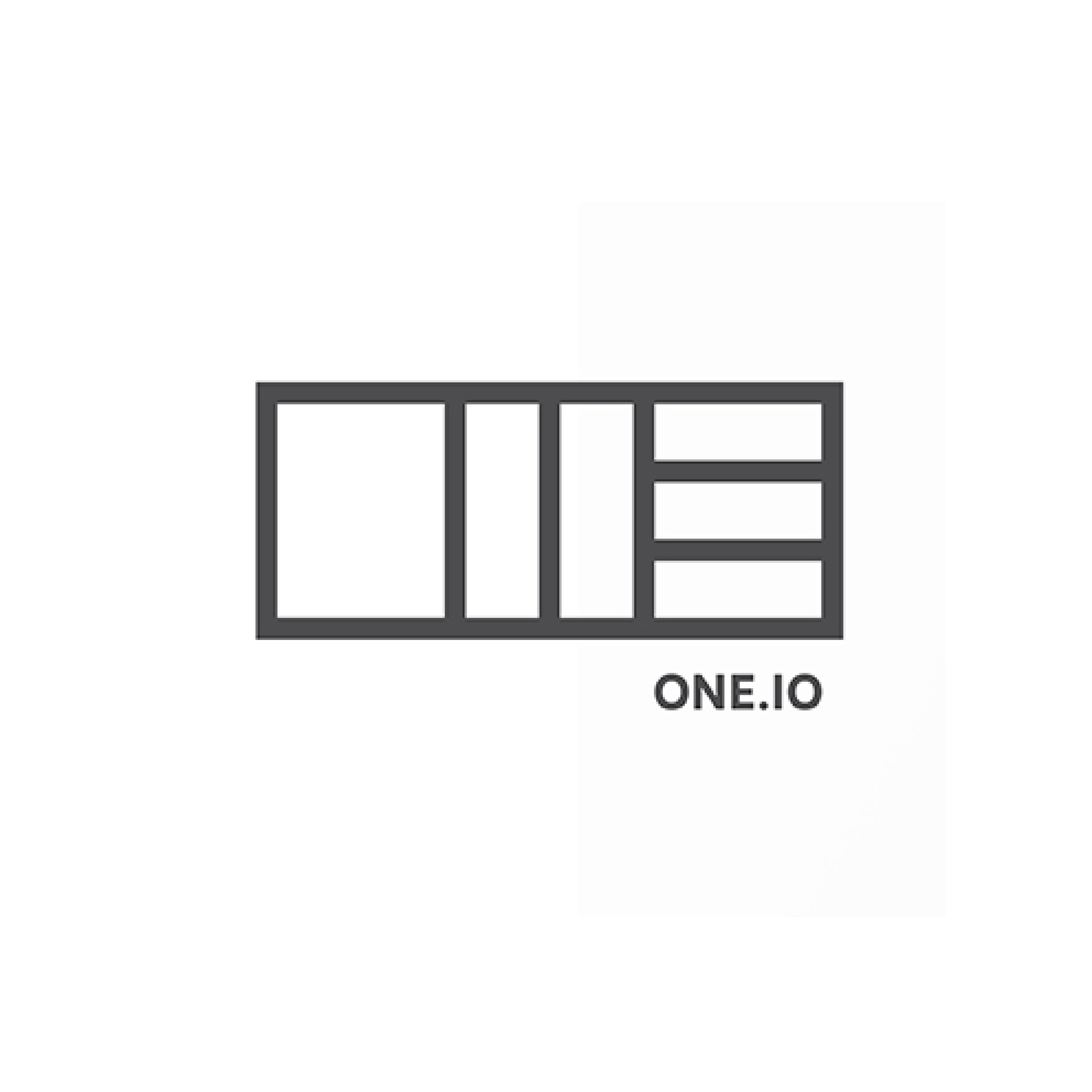
Logo name: ONE.IO
Client: ONE.IO
World zone: Europe & Africa
Country: United Kingdom
Category: Logo
Agency: Brand and Deliver
Description:
ONE.IO is a crypto-based finance company that aims to take the complexity out of banking for its customers. We created a logo that visually represented this simplicity, with each character of the name formed from one equal size block and split into consecutively more pieces. Banking as easy as 1, 2, 3.

Category:
Agency:
Web:
Description:
This is how the grand prize winner is determined: The points awarded by the jury for the logos of a designer or agency are added up. The one who has the most points per logo wins. This year it is Thackway Mccord from New York. Here you can see a few examples of the work of this agency. Thackway McCord has participated in the Bestbrandawards for several years and has been awarded several times. You can find more award-winning work from this agency in our archive.

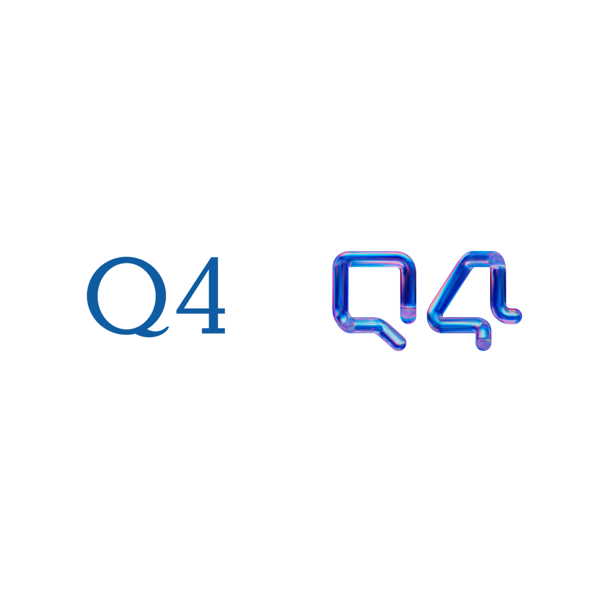
Logo name: Q4
Client: Q4
World zone: The Americas
Country: United States
Category: Logo Redesign
Description:
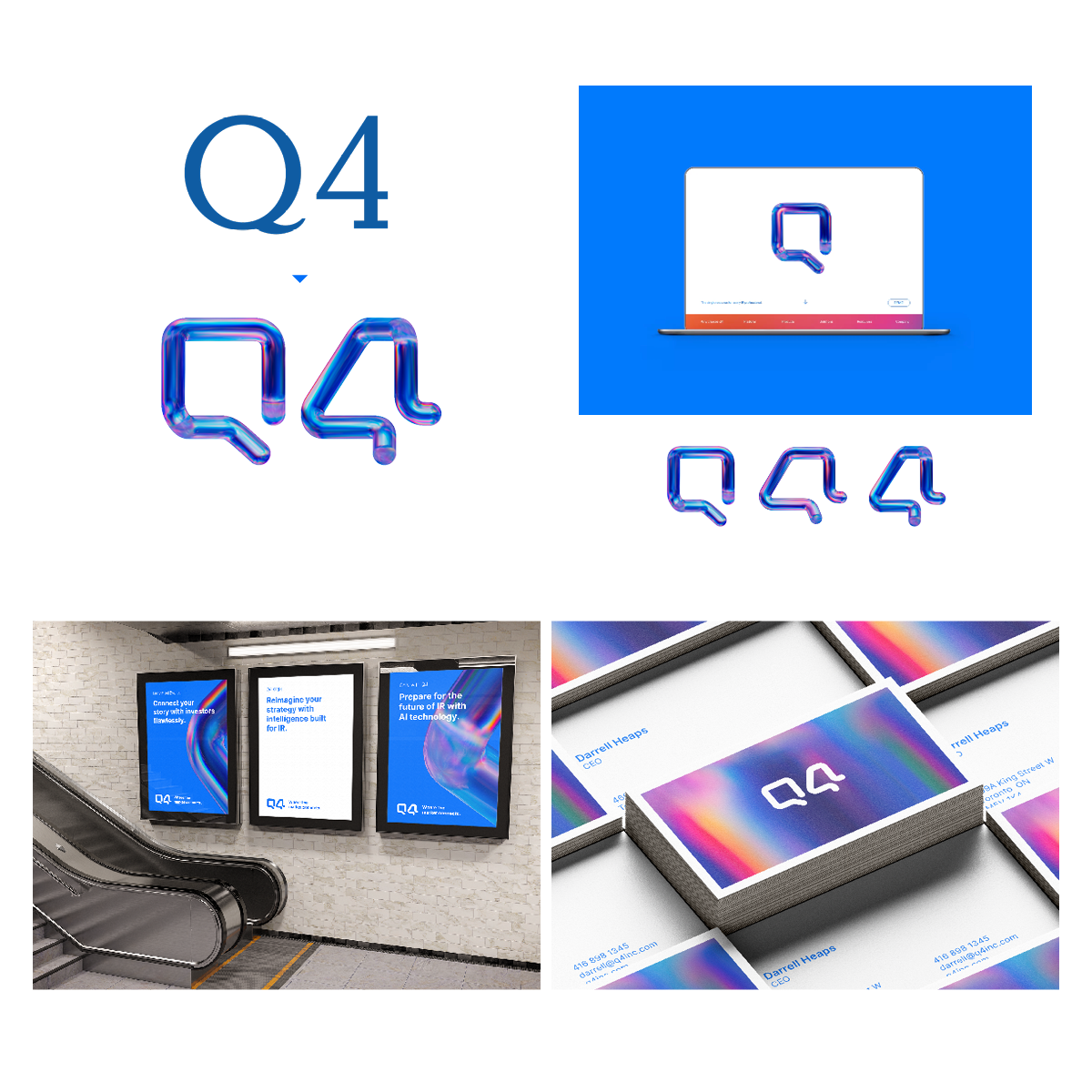
Q4 is the capital markets access platform, an integrated financial information hub, helping navigate the capital markets with confidence. The digital-first animated logo symbolizes connection & collaboration between investors & businesses. When rotated, the Q is seen as the number 4. One form for a two-element name captures the concept of one platform for a complex, multi-sided marketplace prompting a client to remark " Q4 is obviously the Apple or IR".

Logo name: Q4
Client: Q4
World zone: The Americas
Country: United States
Category: Identity Redesign
Description:
Q4 is "Where the market connects", the capital markets access platform, an integrated financial information hub, helping investors and companies navigate the capital markets with confidence providing access by connecting and engaging them via their proprietary technology. The new logo - a single dynamic shape of a Q and when rotated, a 4 - leads a brand with connection and unity at its core prompting a client to remark " Q4 is obviously the Apple or IR".

Logo name: Lifepoint Health
Client: Lifepoint Health
World zone: The Americas
Country: United States
Category: Logo Redesign
Description:
Lifepoint Health is a network of over 300 hospitals and outpatient facilities in small communities dotted across southern United States. The new logo with its multicolored dot heart icon and clean bright colors represents the regional hospital network coming together to offer healthcare excellence close to home. The iconic heart shape is instantly recognizable in communities and the the message underscored with the tagline Great Care Lives Here.

Logo name: Lifepoint Health
Client: Lifepoint Health
World zone: The Americas
Country: United States
Category: Identity Redesign
Description:
Lifepoint Health is a network of over 300 hospitals and outpatient facilities in small communities dotted across southern United States. The new brand with its multicolored dot heart icon represents the regional hospital network coming together to offer healthcare excellence close to home. The friendly supergraphics, the clean and bright colors and portrait photography appeals directly to communities and is summed up with the tagline Great Care Lives Here.

2023


Category:
Agency:
Web:
Description:

2023